Background
R-Squared Designs is an architecture firm based in Queens, NY. Like many small professional service firms, they were operating without a cohesive visual identity which made it harder to project the precision and expertise that architecture clients expect from the first impression.
What I Did
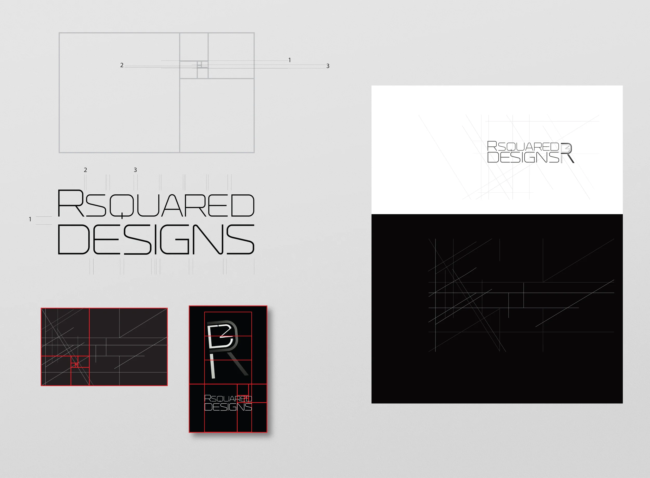
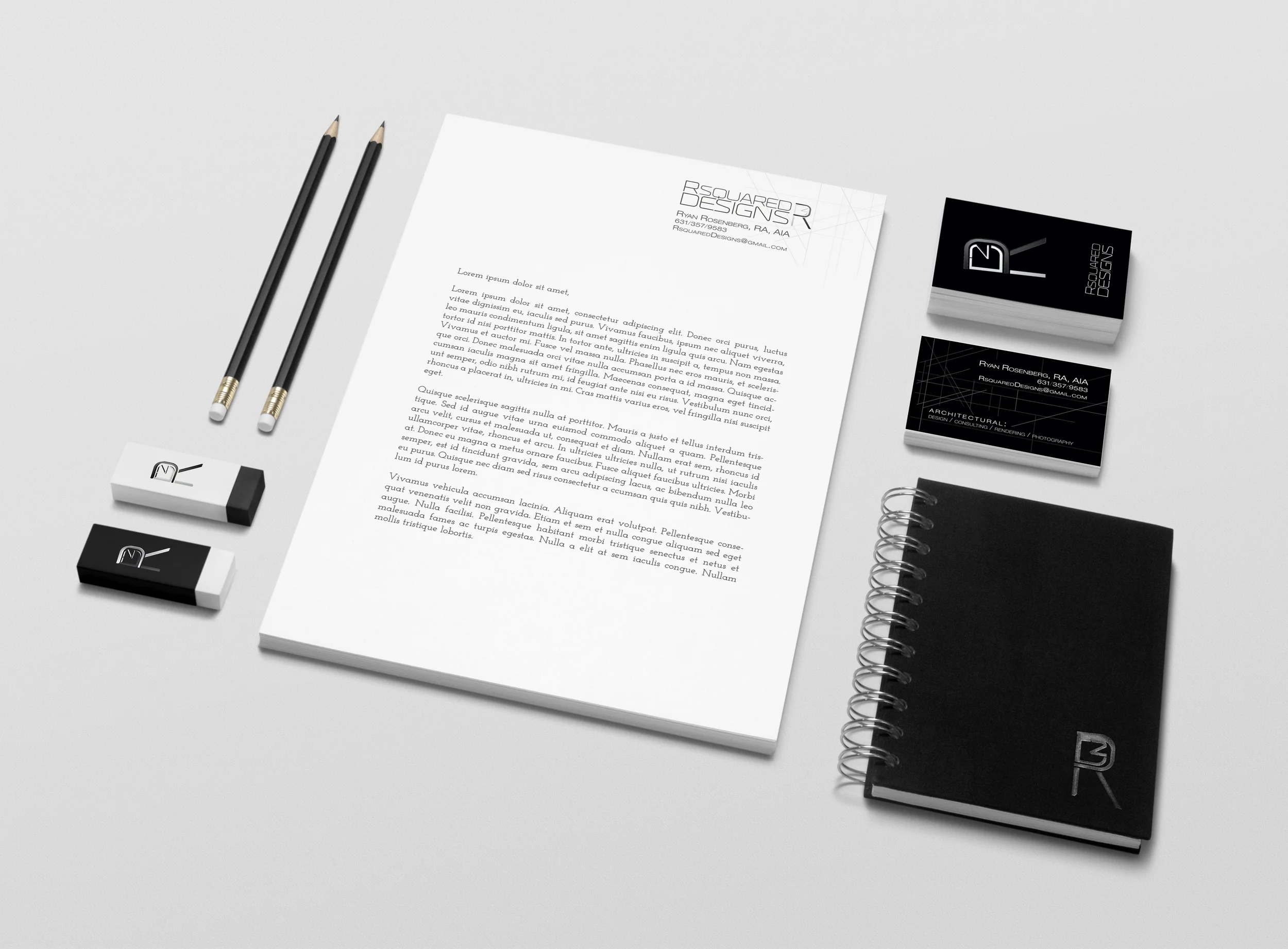
I designed a logo and full stationery system anchored by a monogram that balanced typographic precision with architectural sensibility. The goal was a mark that communicated both the technical rigor of the firm and the elegance of their design work.
Why It Worked
A strong monogram gave R-Squared a mark that felt built, not assembled. The stationery system unified every client communication under a single, professional identity, making the firm look as considered on paper as their projects are in space.